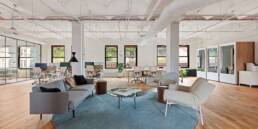
We are amid a design trend that seems to have some serious staying power: open interior spaces rule the day. In the office sector, where once private offices and walled-off cubicles were the standard, we now see it dominated by clustered open desking coupled with highly flexible, secondary space. COVID-19 has thrown a serious wrench into the desire to tightly group people together in an office setting. Anecdotally, I found businesses have still largely opted not to alter much on the design side, ignoring the financial incentives and staggering worker’s hours within proximity to one another. On the residential side, every home renovation show I come across seems to start with demolishing every interior wall structurally possible. I’m looking at you, Chip and Jo. Free-flowing, open floors where rooms bleed from one to another are now the norm.
All this openness has some incredible perks, but it creates the unique design task of designating space where an opaque, physical separation is unwanted. We have compiled our 5 favorite solutions to tackle How to Divide Space in Non-Traditional Ways while still allowing the end user the clear, undivided space they desire.
1) Difference in Material
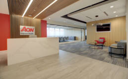
We will often incorporate changes in materials, whether it be flooring, wall, or ceiling finishes, to create visual cues to differentiate space. For instance, a tiled floor can help define a kitchen area, while transitioning to a wood floor or area rug can signify a living or dining area within a home.
2) Curtains
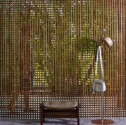
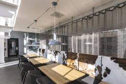
This solution provides a level of separation with a certain lightness and flexibility. Though the mind initially jumps to fabric, we have incorporated unique materials such as metal mesh in a curtain-like use. Playing with the opacity can allow the end user to customize the level of visibility and light passage through the material. For increased flexibility, the curtain can also be mounted on a track from above to allow for expansion and contraction as needed.
3) Screens
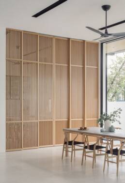
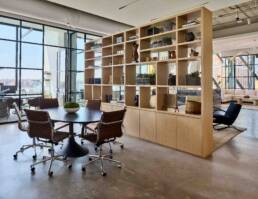
This solution can utilize many exciting building materials, including metal, wood, plastics, or resins, and as with curtains, can be operable by mounting on a track or castors for maximal flexibility. By playing with the patterning and density of a screen, designers can have complete control over how permeable the screen is to light, sound, and visibility.
4) Plant Life
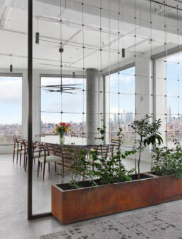
There are vast amounts of studies laying out the benefits of including greenery within our built environment. How to incorporate nature should be top of mind for all designers in any project that allows. For this thought exercise, indoor planters are a great way to separate space while maintaining a visual connection. For a full-height solution, a structural element like a trellis or lattice can be incorporated to allow the plant to grow and train vertically over time.
5) Furniture Arrangements
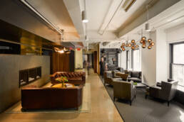
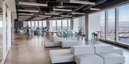
Sometimes, the furniture layout is the simplest way to define sections within an interior. Done well, thoughtfully arranged pieces can properly convey intended zones by themselves. Particularly in the urban, commercial sector, flexibility is more important than ever. Our rapidly shifting idea of what a workplace is, means that employers must be on their toes and be able to adapt to the times. This philosophy has given rise to loosely defined office space, remaining highly adaptable with moveable or even multi-functional furniture.
For the foreseeable future, clients will continue to desire large open spaces, and it is our creative task to make sense and find organization. We hope you were able to find these strategies informative, and the next time you hear someone recommend “taking out a wall,” you’ll have a good idea of the potential of a project. Constraints breed inventive solutions, and as designers, we like it that way.

